Parallel
Logo and visual identity design for Parallel, a Los Angeles-based start-up providing a personalised mentorship service for young students by building a role model relationships with more experienced student mentors in academic life.
Visual identity
/25
CONCEPT
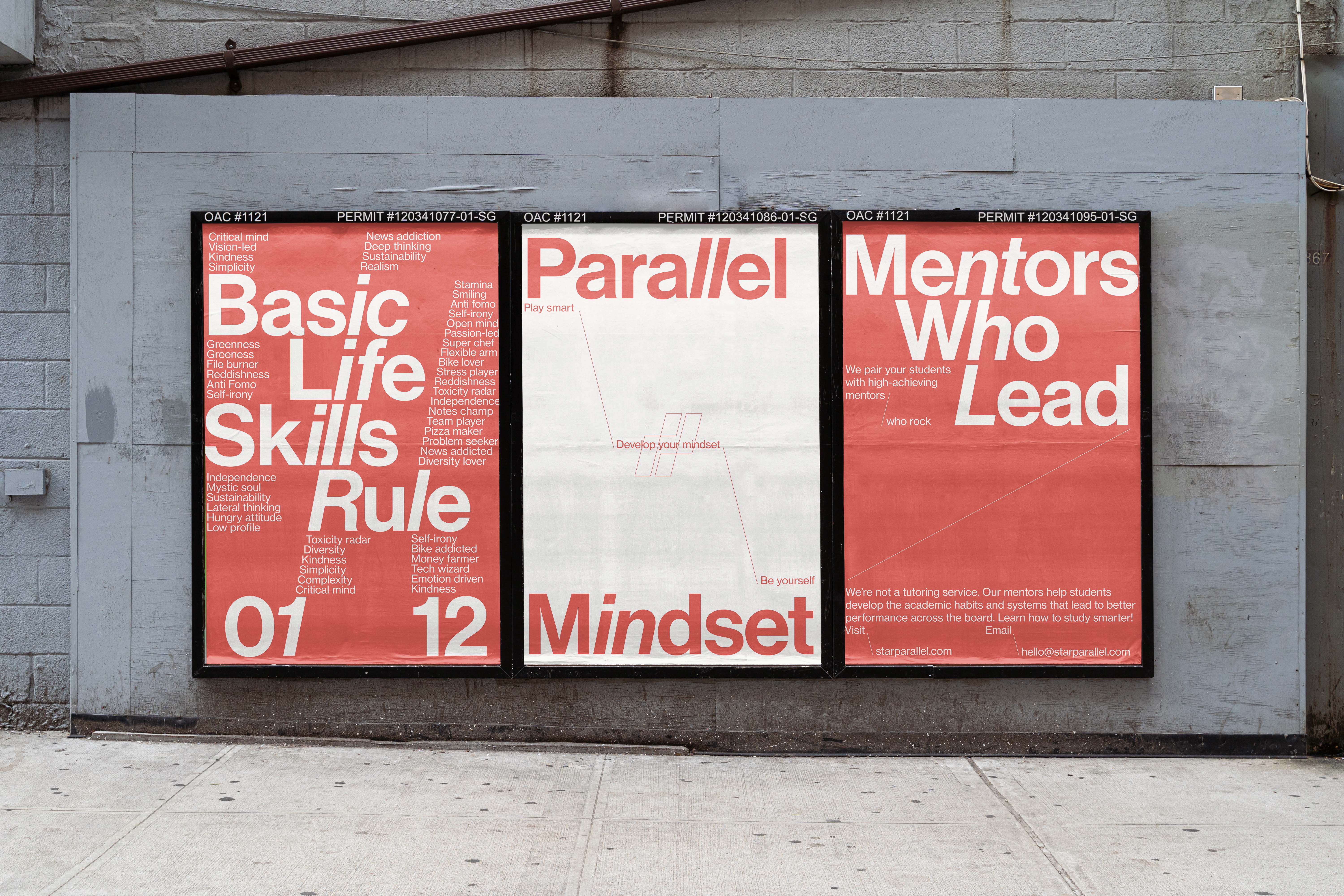
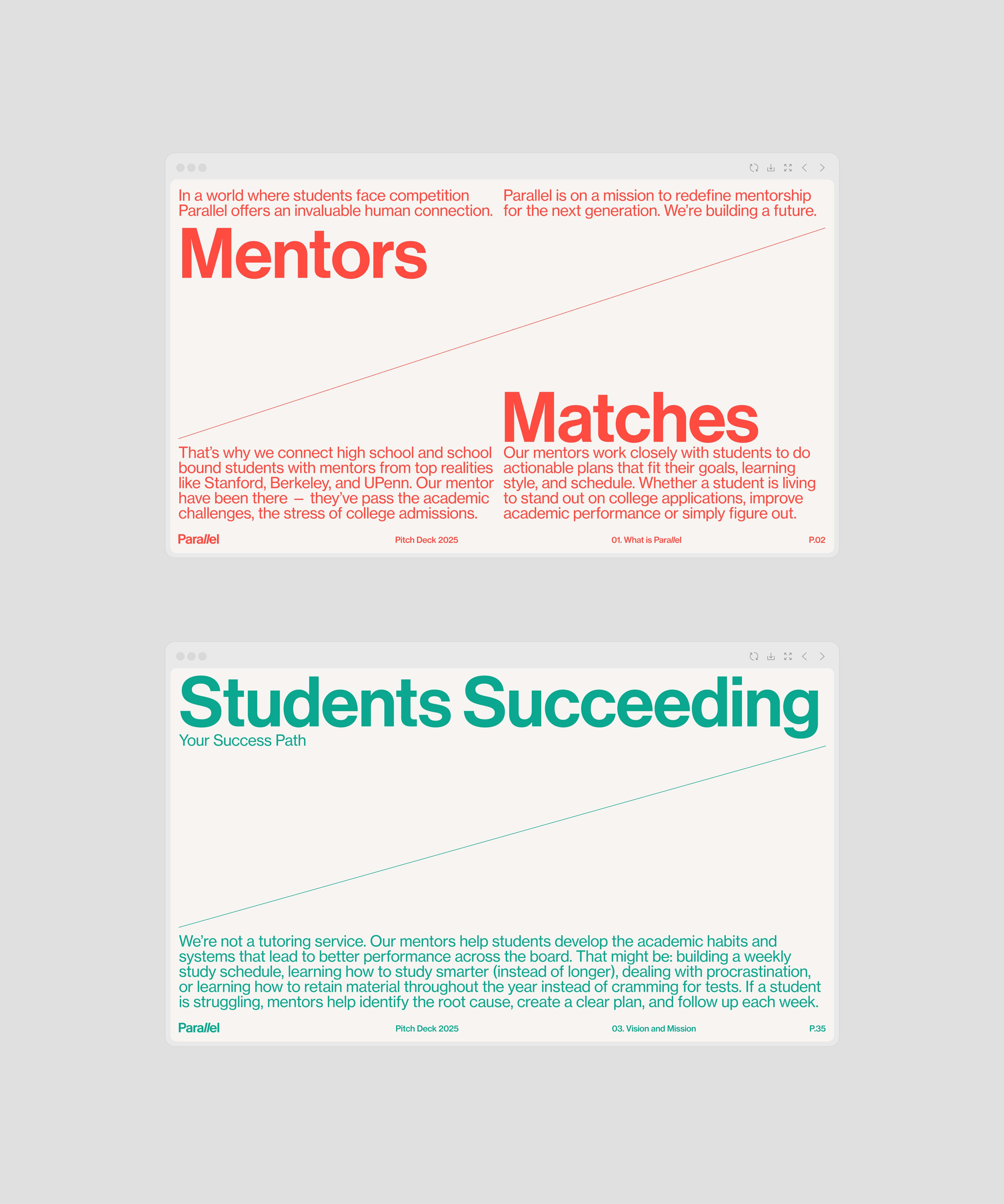
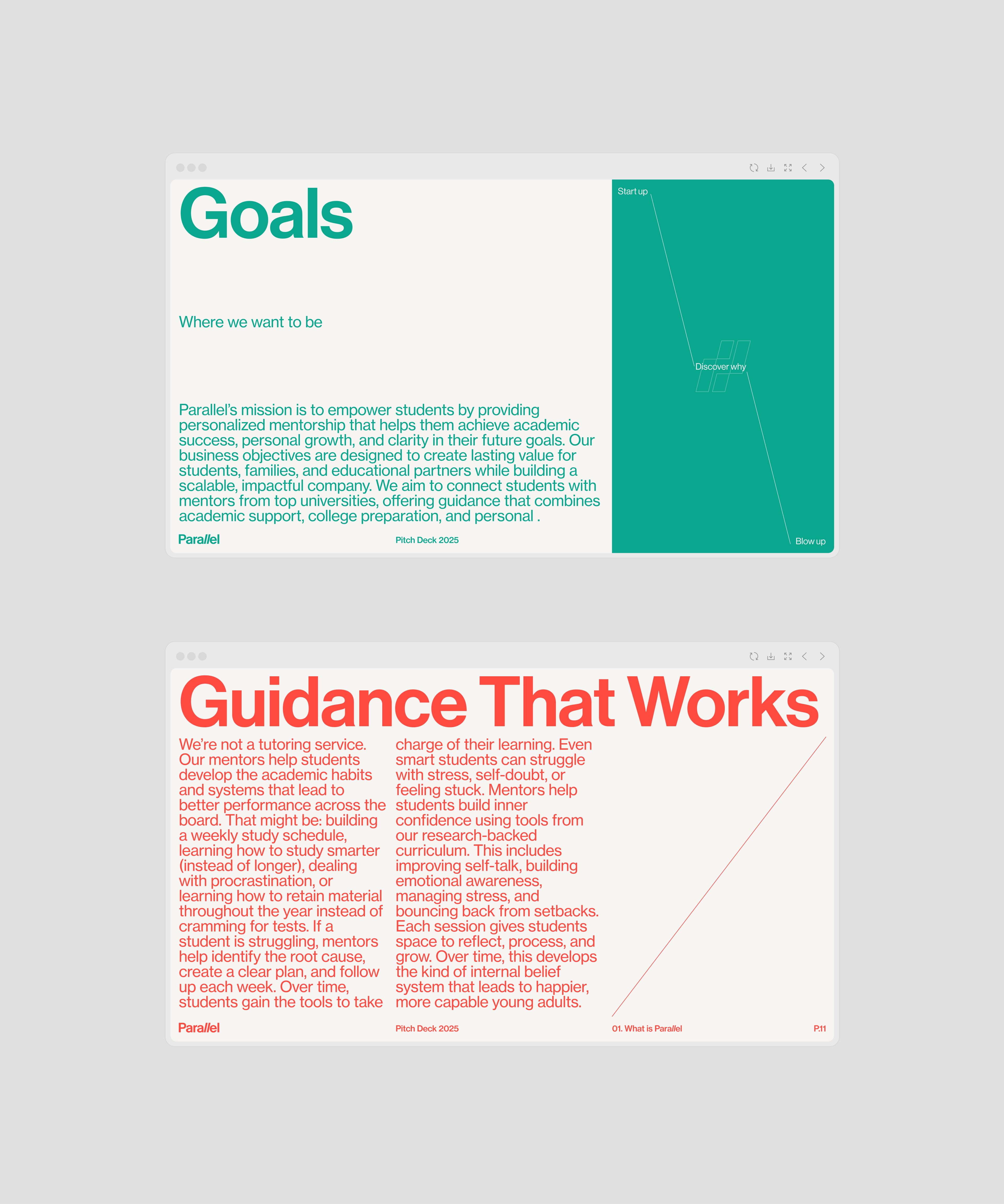
Parallel wanted to communicate its premium and sophisticated soul, in a market context where most platforms communicate in a much more playful and youthful way. The concept I started from is inspired by the name, Parallel, which symbolises a path of growth and parallel accompaniment of the mentor and mentee, brought back to the graphic sign of growth and rise. The line then becomes the protagonist of the visual identity, a line that grows, connects and marks a path for the eye and the mind.
REQUIREMENTS
Parallel needed a strong enough visual identity to differentiate itself in a rather crowded market environment. The way it chose to do this was communicated to me in a strong and decisive way: we want to be premium, but not snobby, trustworthy, but not cold. Being a company at the beginning of its operations, the challenge was to provide a very strong visual identity at the beginning, capable of adapting quickly to any communication context, while maintaining its recognisability and personality.
output
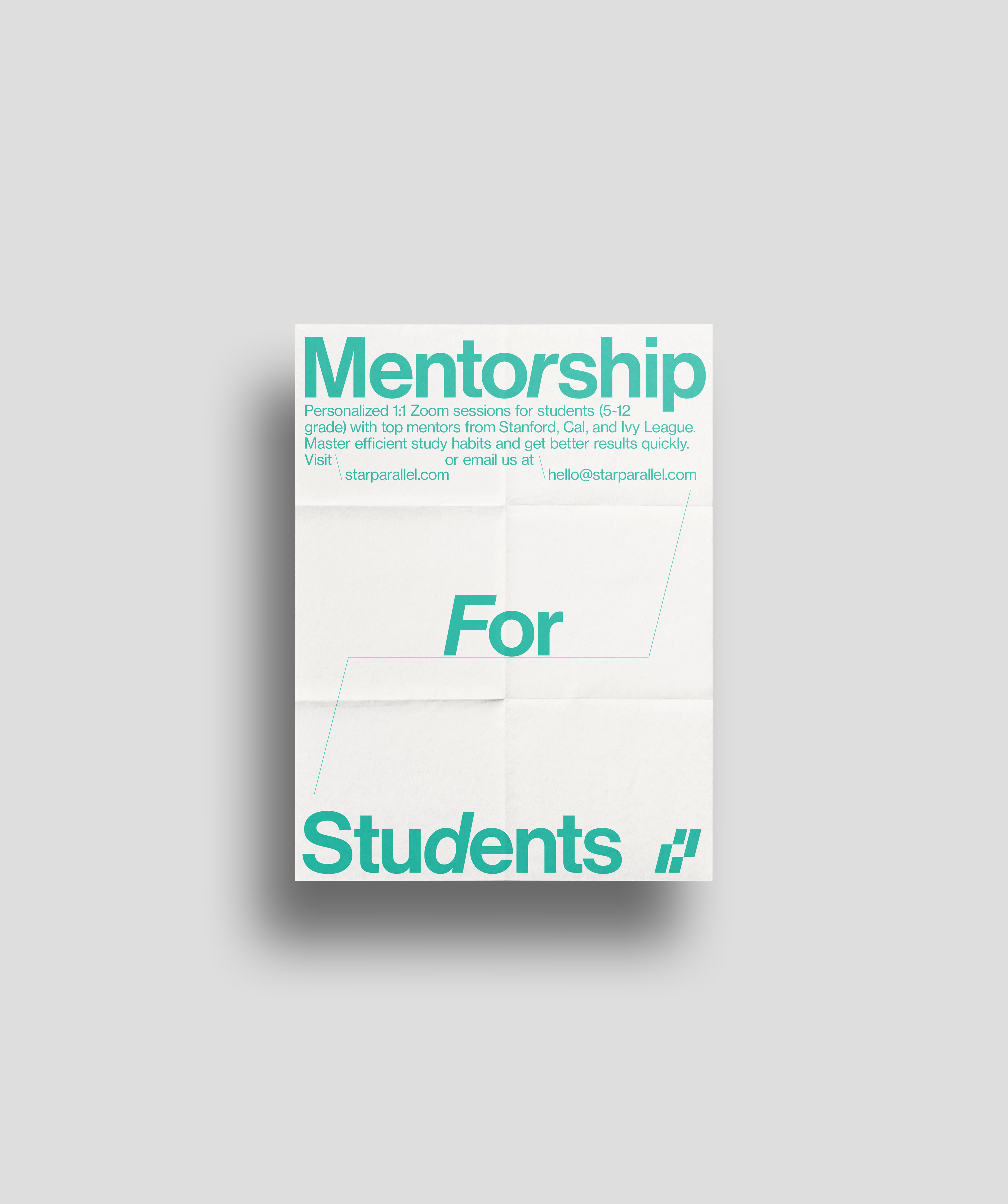
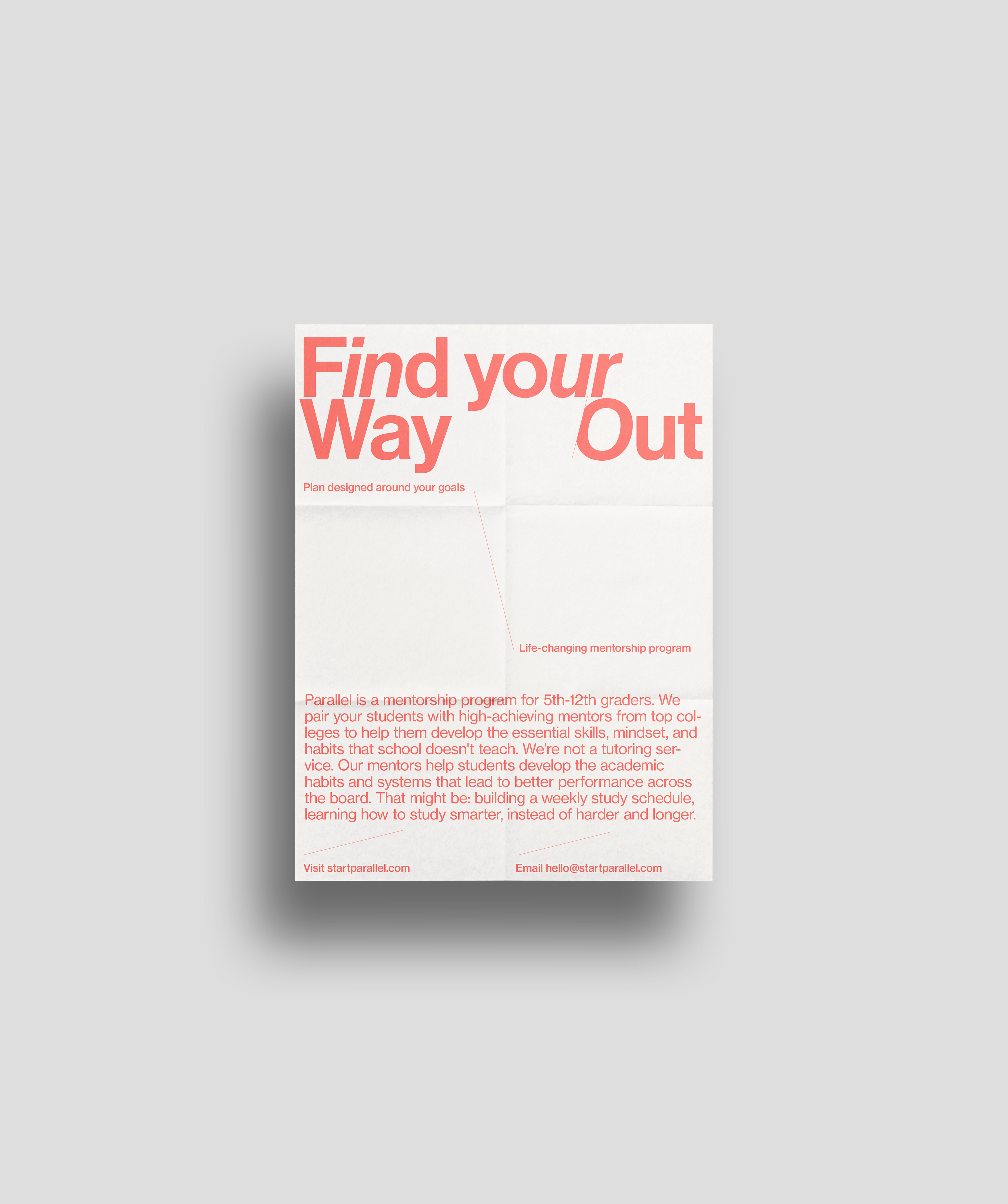
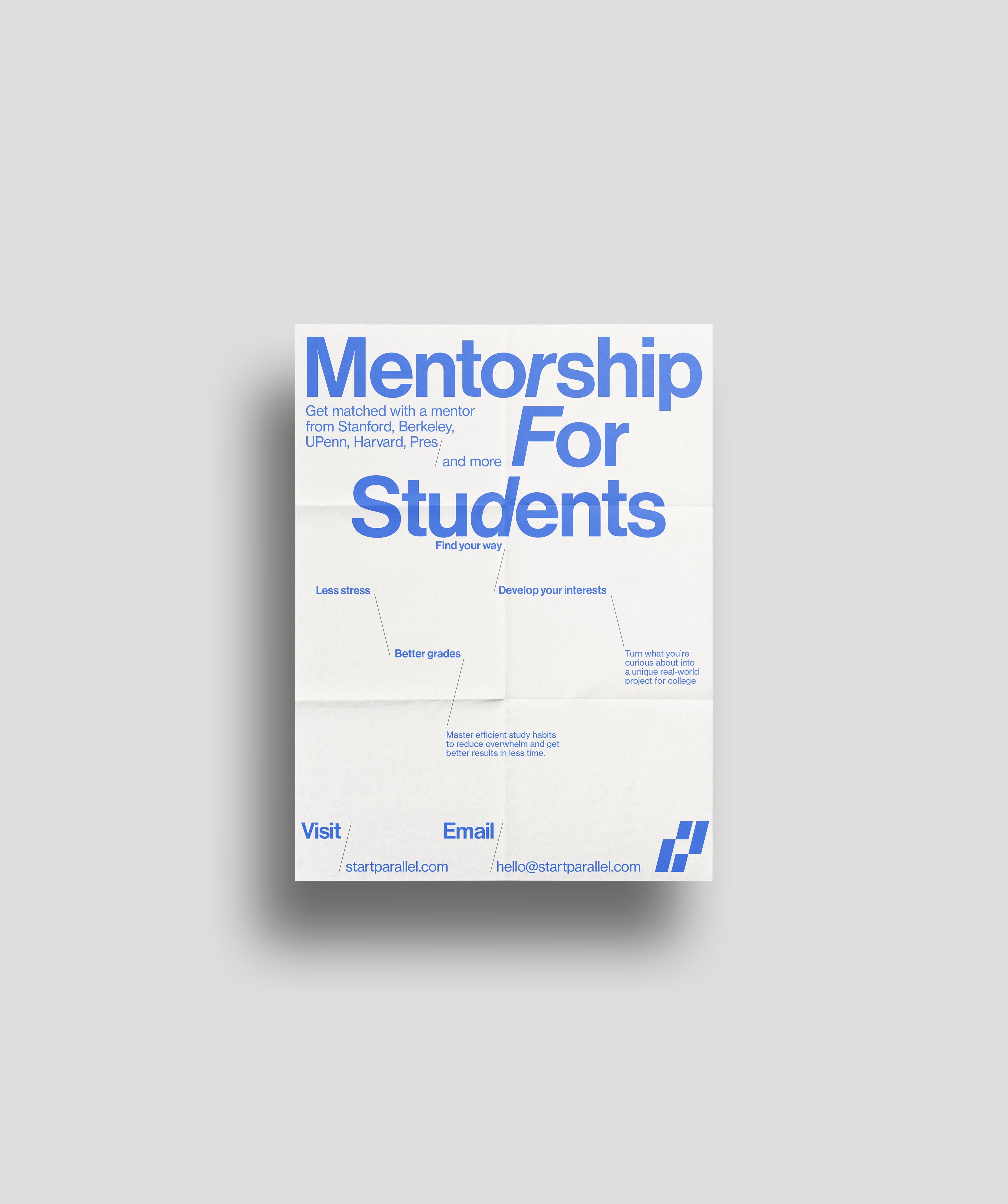
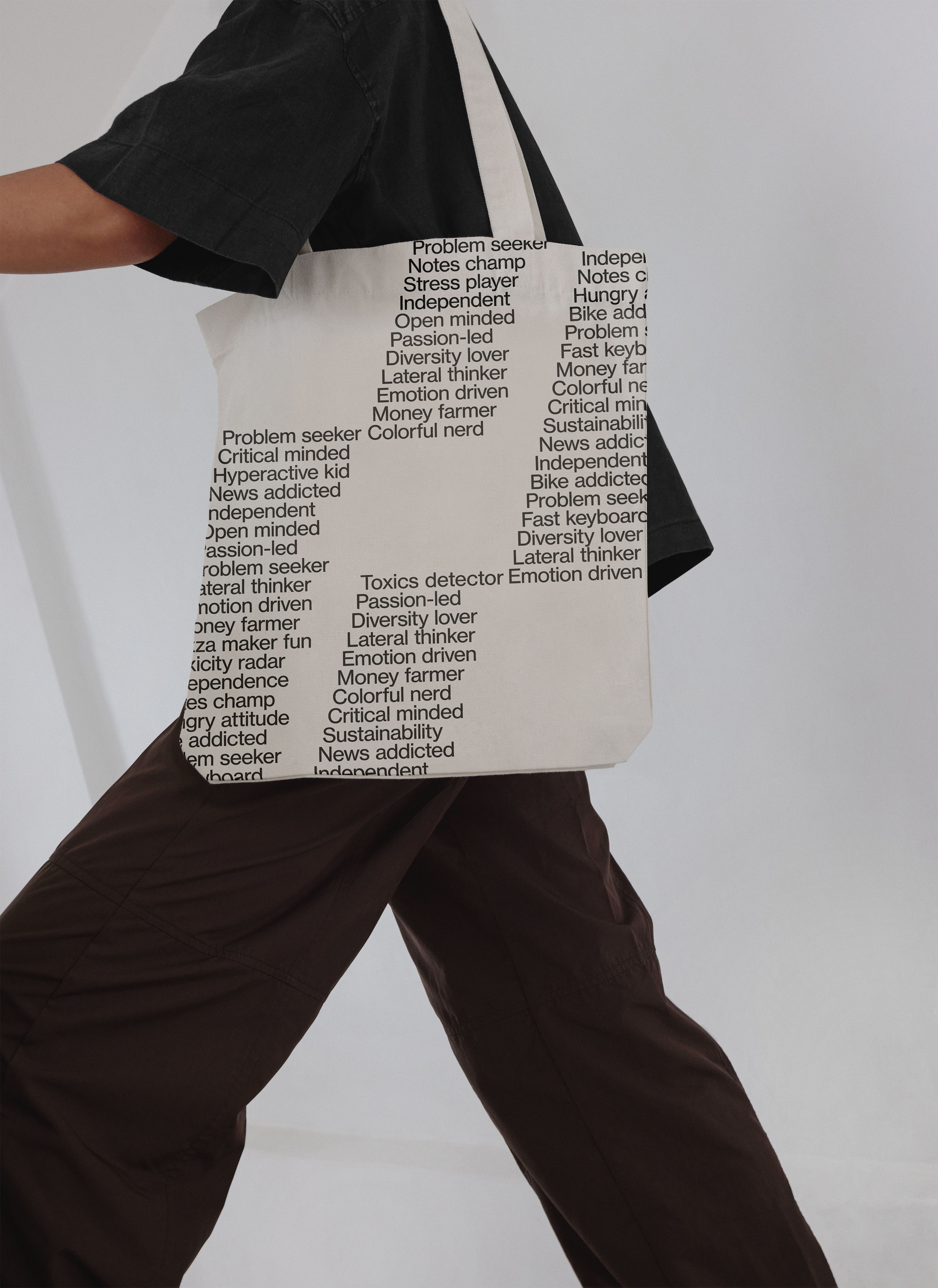
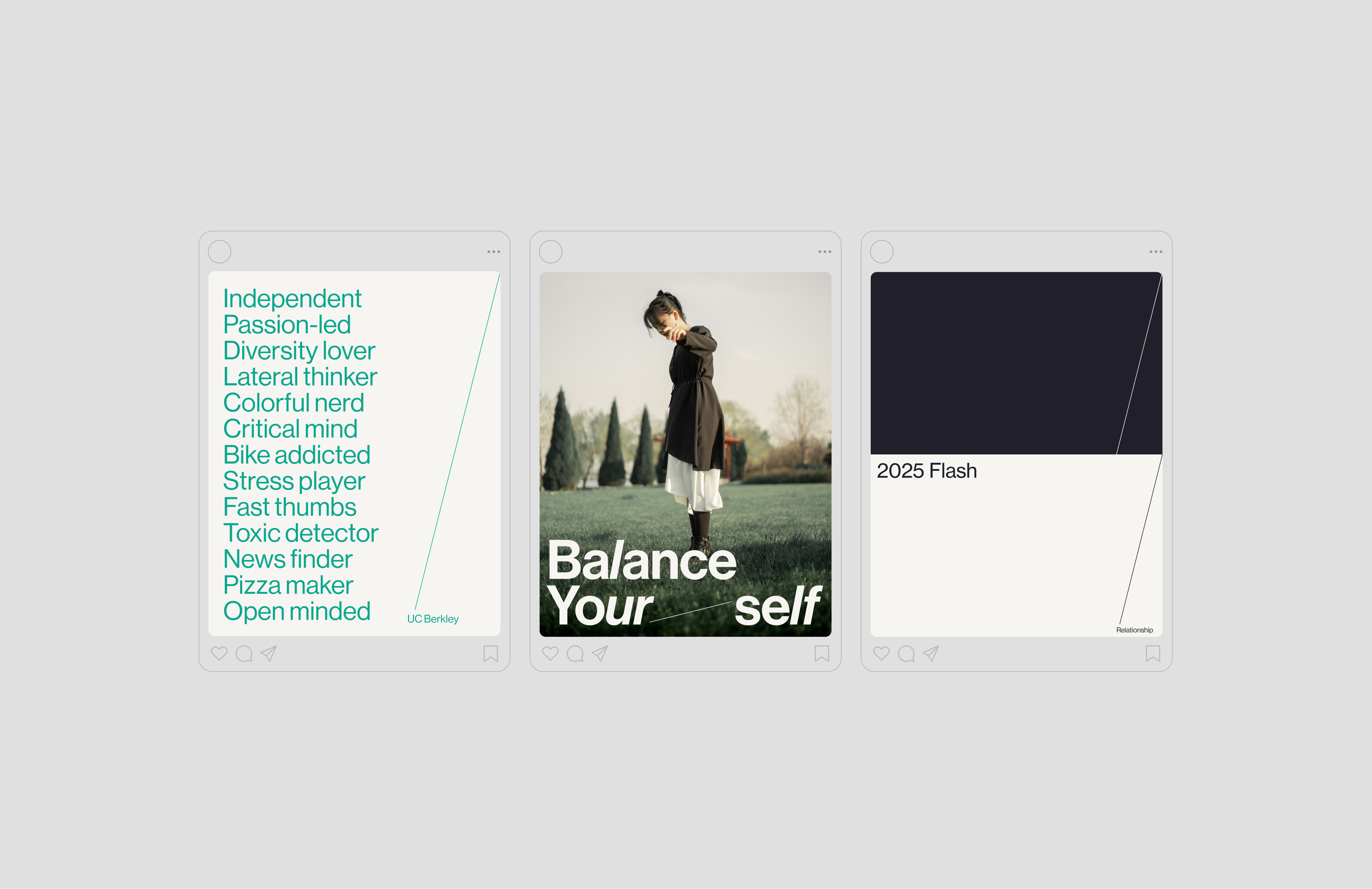
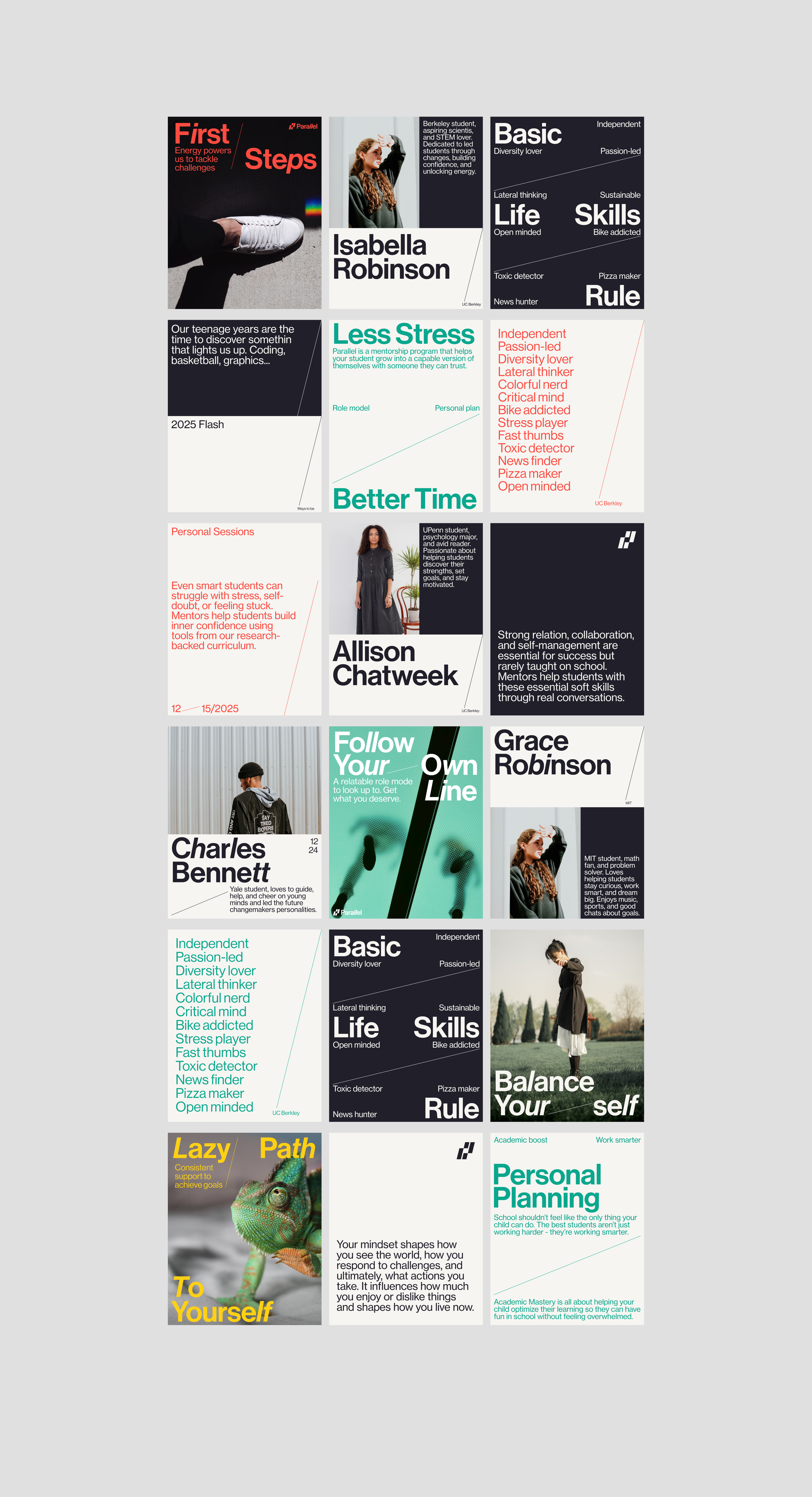
The first outputs on which the visual identity was created were flyers, posters, pitch decks and social media graphics: the basic tools for the start-up's first communication campaigns. The visual identity proved to be able to adapt flexibly to online and offline media, guaranteeing strong immediate recognisability right from the start, which for a start-up is a point of value that makes all the difference, both to users and investors.
Premium, but not snobbish
Starting with a very strong graphic concept, a parallel growth, the line becomes the protagonist of the visual identity. A line that grows, connects and marks a path both for the eye and the mind.